Style
Example
Text Only
Graphic Only
Text on Top

Text on Bottom

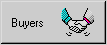
Text on Right
Text on Left
Push buttons provide a method of starting processing in an application.
A push button can display a text item, a graphic item, or both text and graphics. In versions of Dexterity prior to 6.0, only native pictures could be used. Now, pictures or native pictures can be used.
Use the Style property for the push button field to specify which types of items are displayed on the button. The Style property also controls the arrangement of the items.
The following table shows the arrangements possible for text and graphics on a push button.
![[spacer]](1p.gif)
|
Style |
Example |
|---|---|
|
Text Only |
|
|
Graphic Only |
|
|
Text on Top |
|
|
Text on Bottom |
|
|
Text on Right |
|
|
Text on Left |
|
A push button can have up to three images: an Up image, a Down image and an Over image. The Up image is displayed when the button isn’t being clicked. The Down image is displayed when the button is being clicked. The Over image is displayed when the pointer is positioned over the push button.
If you supply only the Up image for a push button, the Down image will be drawn automatically when the push button is clicked.

|
You can use the Field_SetImage() function to specify the images to use for a push button from within scripts. |
The Appearance property specifies what type of border appears for a push button. A push button can have a 2-D border or 3-D border.
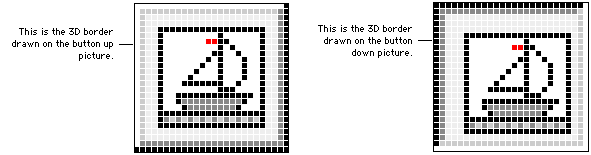
When designing the button graphics, keep in mind that the 3D border will be drawn on top of the outer two rows of pixels on the button up and button down images.
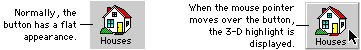
You can also use the Appearance property to have push button display with a 3-D highlight. With this setting, the push button has a flat appearance until the mouse pointer is moved over the button. Then the button displays a 3-D appearance. An example is shown in the following illustration.
|
If you select 3D Highlight for the Appearance property, the text caption in the push button will become bold when the field has the focus. Be sure to provide extra space for the caption to accommodate the bold text. |
Several properties for push buttons control their behavior.
Use this property to specify which push button field change script will run when the user presses ENTER when the window is active. Only one push button in a window should have this property set to true. Typically, this property is set to true for an OK button that appears in the window.
|
Use the Field_SetBooleanProperty() and Field_GetBooleanProperty() functions to change the Default property from within scripts. |
Use this property to specify which push button field change script will run when the user presses ESC when the window is active. Only one push button in a window should have this property set to true. Typically, this property is set to true for a Cancel button that appears in the window.
|
Use the Field_SetBooleanProperty() and Field_GetBooleanProperty() functions to change the Cancel property from within scripts. |
This property should be set to true for Close or Cancel buttons appearing in the window. When Hyperspace is set to true, the Close or Cancel button can be clicked without running the change script or post script for the currently-focused field. Only the change script for the Close or Cancel button will run. This allows the user to close the window, even though the change or post script for the current field may have prevented it.